Keet Health
Digital patient engagement and clinical outcomes platform for rehab and MSK care.
Providers use Keet to drive patient adherence, automate care plans, track outcomes (PROMs), and run remote therapeutic monitoring (RTM) — across a patient-facing app and a provider dashboard. I worked on the dashboard suite, the care plan template editor, patient cohorts, the workflow builder, and the underlying component library.
- Role
- Product designer
- Scope
- 11 screens · component library
- Client
- Keet Health
Overview
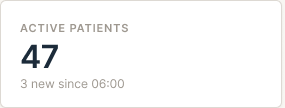
This is the home screen people land on. The goal was to show how the clinic is doing right when you log in, without making you click around.
Top metrics, a quick patient growth chart, and the things you actually care about checking in the morning.
NPS Dashboard
The main NPS screen. One big number up top so you know how you're doing, then everything else underneath it for context.
Spent a lot of time figuring out what to show first vs what to push down. Ended up cutting more than I kept.
View All Providers
List of every provider with their NPS score next to their name. Before this, people were exporting to Excel just to sort by score.
Sortable columns, search, filters at the top. Nothing fancy, just had to actually work.
View All Trends
NPS over time. Mostly here so leadership can tell if things are getting better or worse without doing the math.
Kept the chart simple. One line, clear date range, no extra noise.
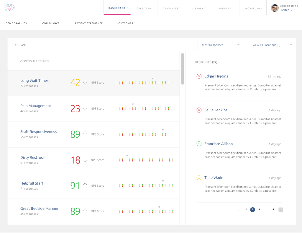
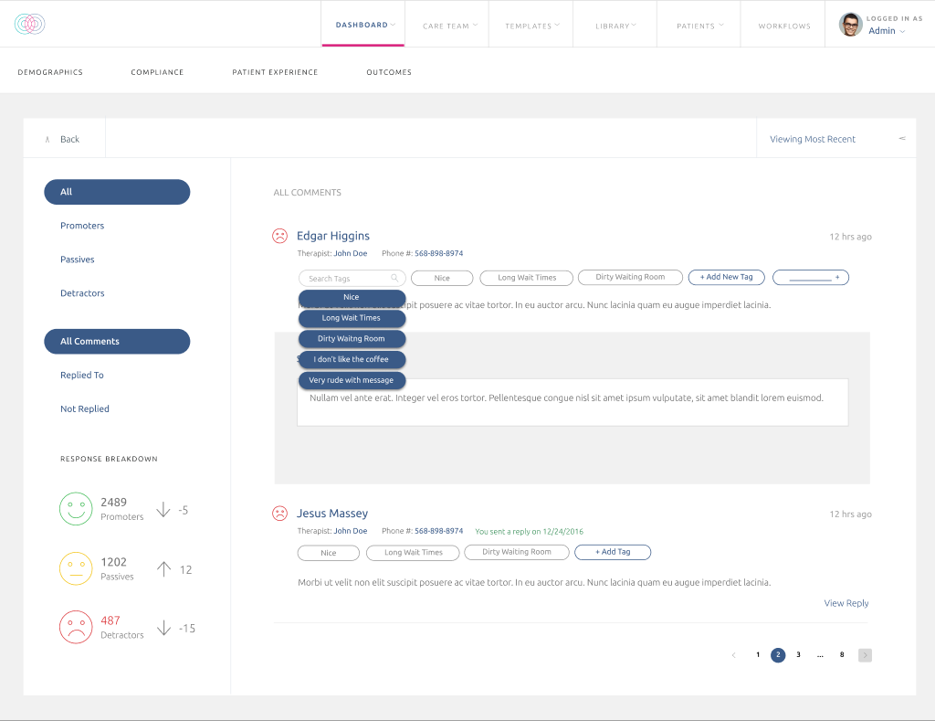
View All Responses
Actual patient comments, not just the scores. The numbers don't mean much without reading what people are saying.
Filter by score, location, date — find one comment, see its context, move on.
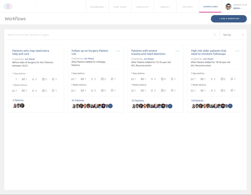
Workflow Builder
A separate tool inside Keet for building care plan workflows — pick a patient group, set a trigger, add steps, save it. Used by clinical staff to automate stuff that used to be manual.
This is the grid view where you see all the workflows you've built. The actual builder is its own multi-step flow.
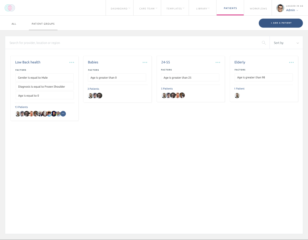
Patient Groups
Cohorts of patients grouped by rules — like "Low Back Health: gender = M, diagnosis = X, age = 0+". Each card shows the rules, the patient count, and avatars of who's in it.
The point was to make it feel less like writing a SQL query and more like building a list.
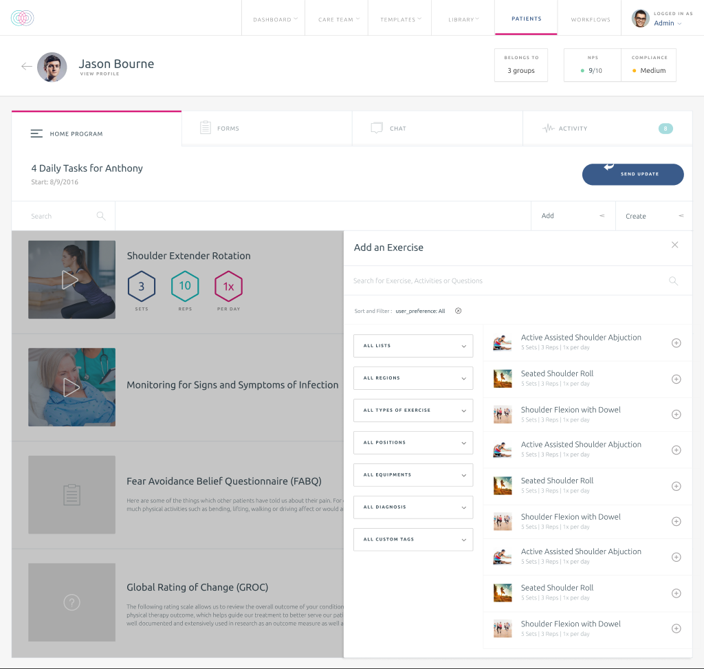
Patient Care Plan
A single patient's care plan, with the Add Exercise modal sliding in from the right. Tabs across the top for Home Program, Forms, Chat, and Activity.
The modal lets you filter the exercise library and drop exercises directly into the plan without losing your place.
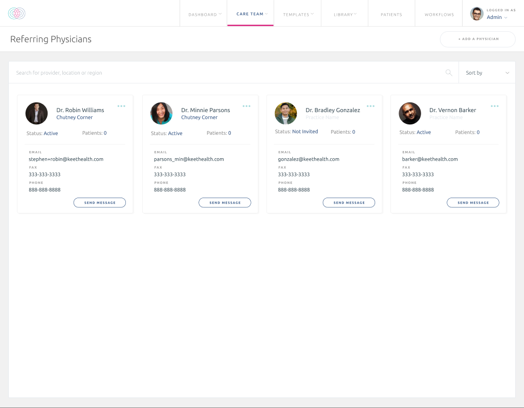
Care Team
Provider directory. Each card has the doctor, their practice, contact info, and a quick way to message them.
Tried to keep it warmer than a typical staff list — avatars, real contact details, status, and a clear primary action.
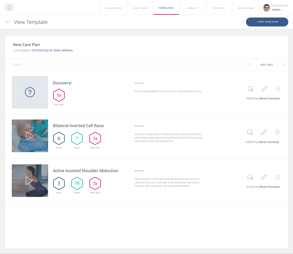
Care Plan Template
The editor for a single care plan template. Each row is a task — exercise name, sets, reps, per day, and a thumbnail you can preview.
Lots of small components on this one: number steppers, video previews, edit/delete/comment controls per row. Had to keep it dense without it feeling cluttered.
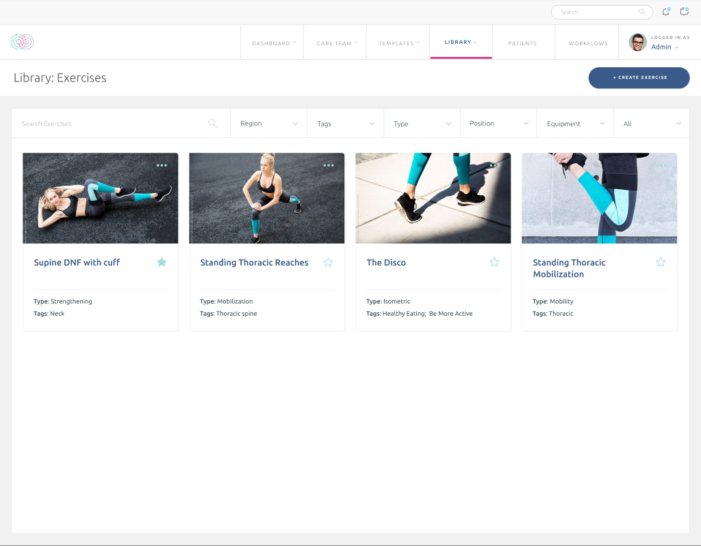
Exercise Library
Catalog of exercises clinicians can pull into a care plan. Image up top, name, type, tags, and a star to favorite the ones you use a lot.
Designed so you could find an exercise by tag, by type, or just by recognizing the photo.
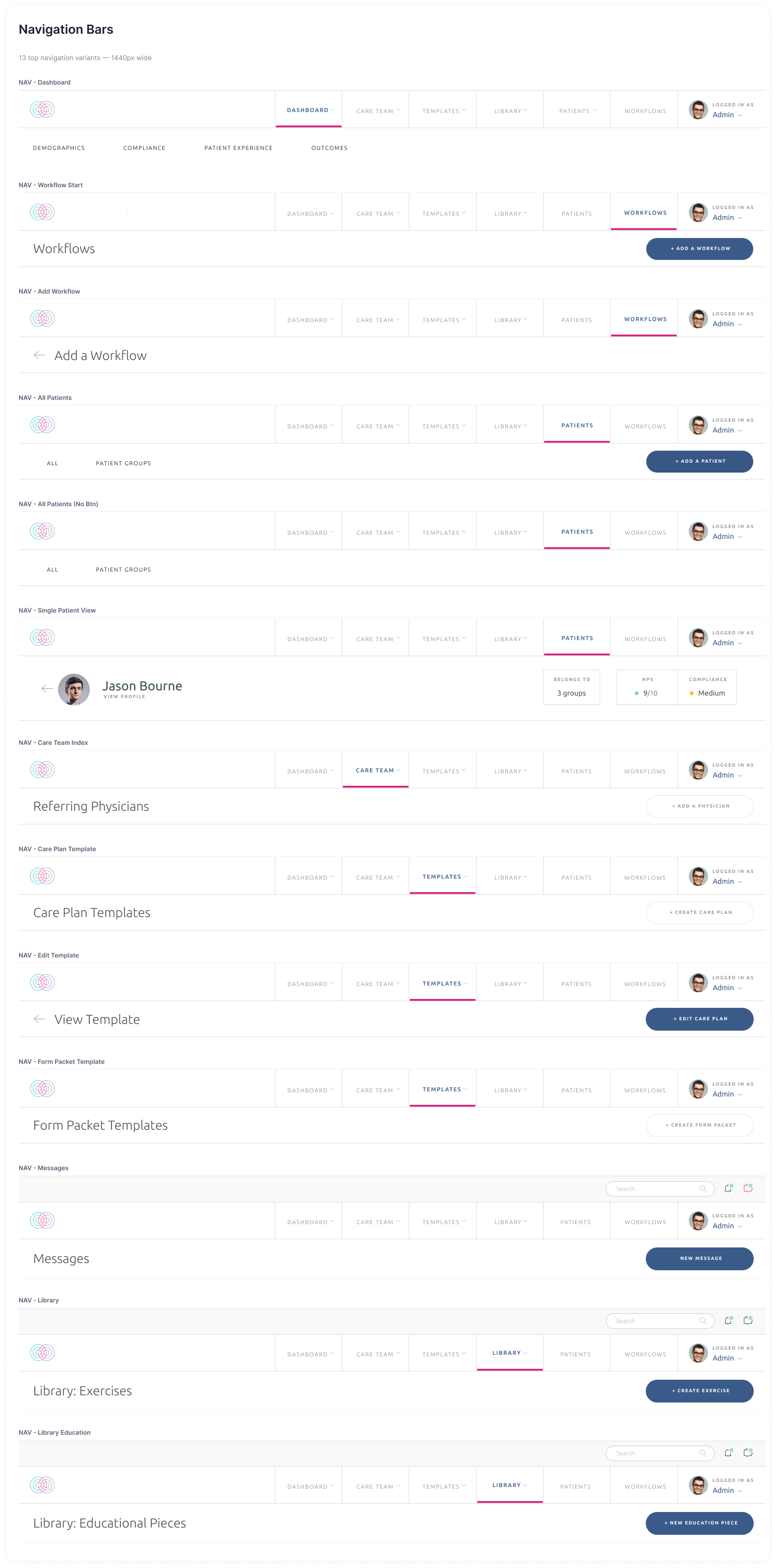
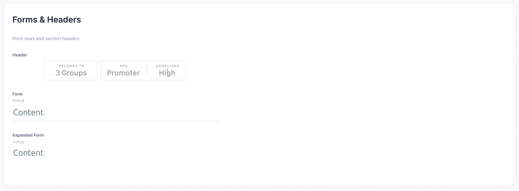
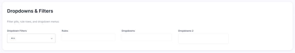
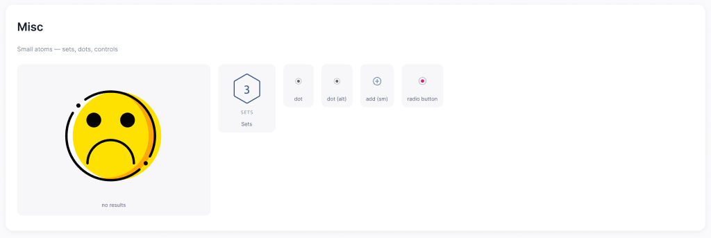
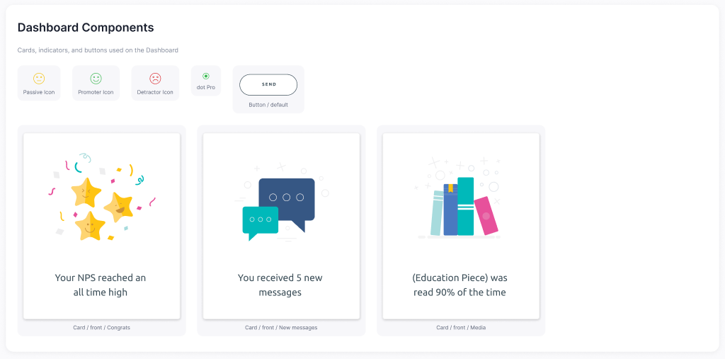
Component Library
The shared symbols file behind everything else. Nav bars, form rows, dropdowns, 54 icons, dashboard cards — all the pieces the screens are built out of.
Built so engineers and other designers could pull from a single source instead of re-creating the same button for the tenth time.
- 13 Navigation Bars
- 3 Forms & Headers
- 4 Dropdowns & Filters
- 54 Icons
- 5 Misc atoms
- 8 Dashboard Components
Meridian
Care coordination tool for hospital wards.
Designed the dashboard, single-patient view, shift handoffs, task management, care team grids, and reporting. Plus the underlying component library that holds the whole system together.
- Role
- Product designer
- Scope
- 6 screens · 26 components
- Client
- Meridian
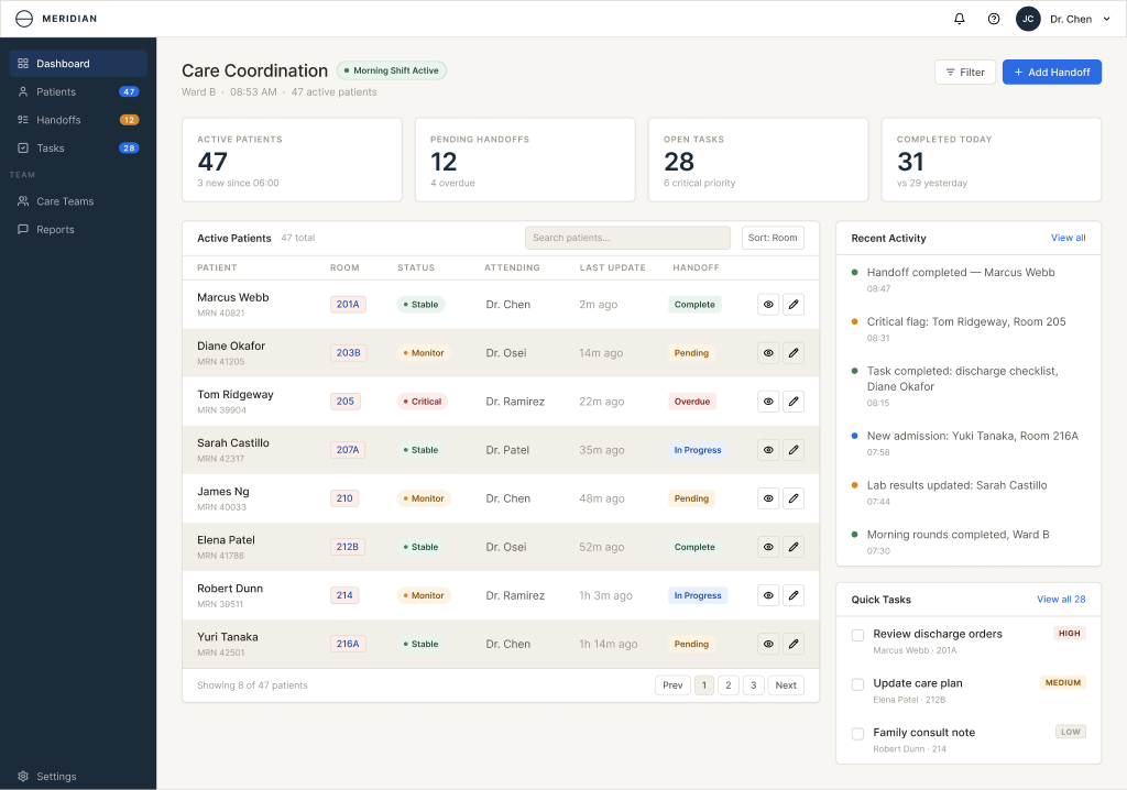
Dashboard
Care coordination home for ward staff. Top stat cards, the active patient table in the middle, and a side panel for recent activity and quick tasks.
Designed for someone walking in at the start of a shift who needs to know what's going on in 10 seconds.
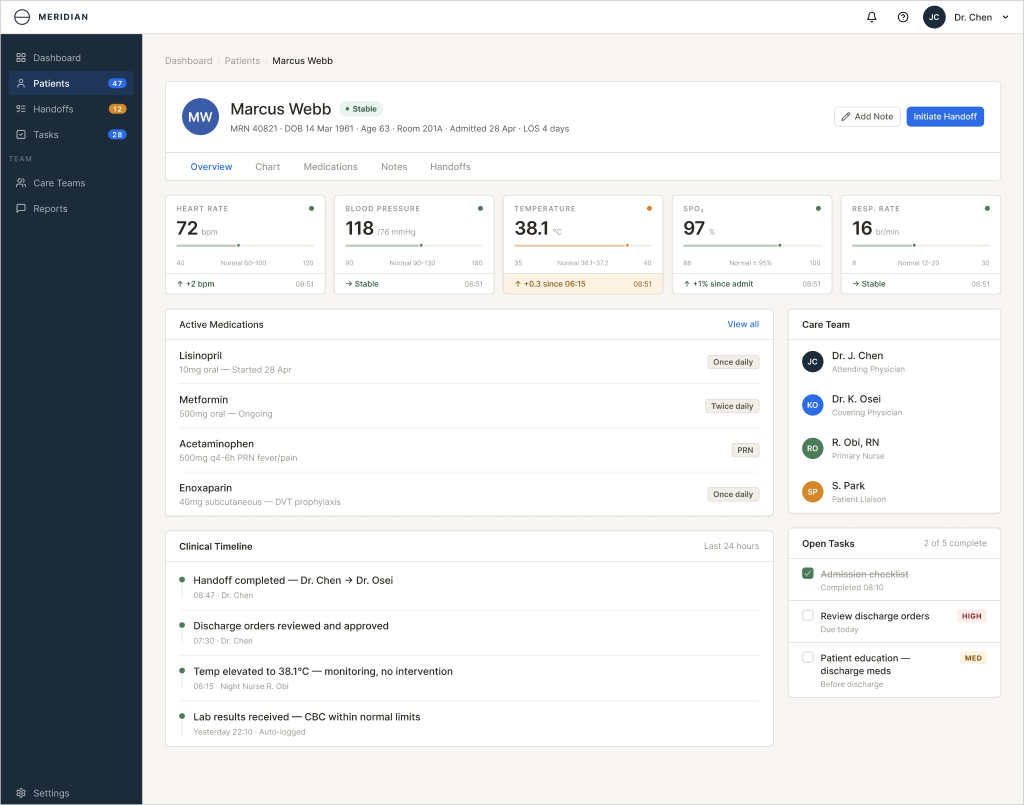
Patient Detail
Single patient view — header with name, MRN, room, length of stay. Vitals as cards across the top, then medications, clinical timeline, care team, and open tasks.
Lots of data on one page. The challenge was making it scannable without losing the alerts.
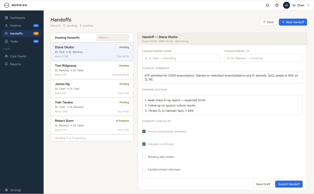
Handoffs
Pending handoffs on the left, compose form on the right. Structured fields for pending actions and a checklist so nothing gets dropped between shifts.
Replaced what used to be a freeform note with something a receiving nurse could actually act on.
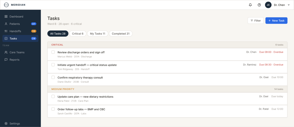
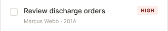
Tasks
Tasks grouped by priority — critical first, then medium. Tabs for All, Critical, My Tasks, and Completed.
Wanted the list to look like a list, not a spreadsheet. Priority is encoded with weight and color, not a status column.
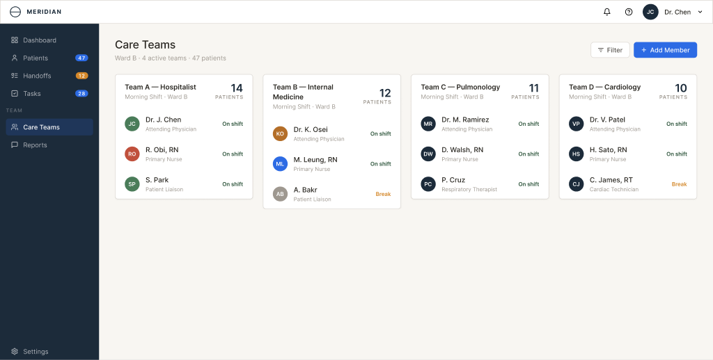
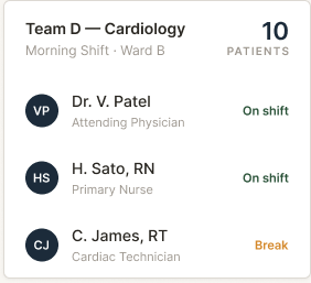
Care Teams
Team cards laid out as a grid. Each team has its members, the patients it covers, and current load at a glance.
The grid was the easiest format for a charge nurse to scan and reassign people when someone calls out.
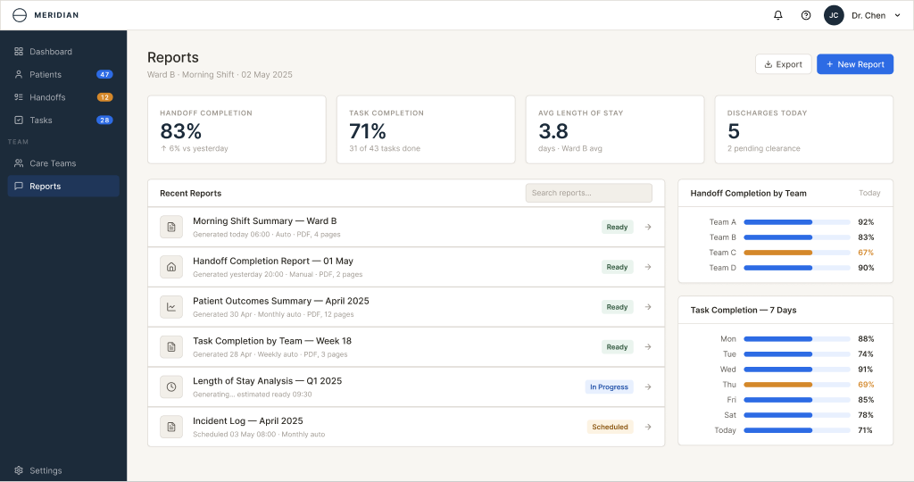
Reports
Shift-level reports with the summary stats up top, the recent reports list on the left, and a couple of charts on the right (handoff completion by team, task completion over 7 days).
Built more for unit leads than ward staff — the audience is people who need numbers for the morning huddle.
Component Library
The shared UI pieces the Meridian screens are built out of — nav bars, cards, table rows, timeline items, charts.
Most of these are reused across two or three of the screens, so it was worth pulling them into a real library instead of redrawing each one.
- 3 Navigation
- 5 Buttons & Inputs
- 4 Tags & Badges
- 3 Cards
- 10 Rows & Items
- 1 Chart


WP Engine
Managed WordPress hosting platform.
Customer portal dashboard redesign, plus the Platform marketing page top to bottom — hero, feature grid, how-it-works, callouts, and a long-form story arc that holds attention without padding the page.
- Role
- Product designer
- Scope
- 5 screens · web + marketing
- Client
- WP Engine
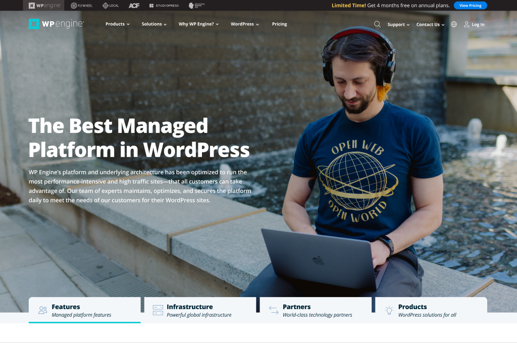
Hero / Header
Top of the platform marketing page — headline, supporting copy, and a four-column ribbon highlighting Features, Infrastructure, Partners, and Products.
The ribbon doubles as anchor links into the rest of the page.
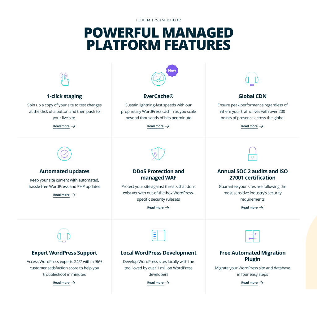
Feature Grid
Centered feature grid — managed platform features grouped into a scannable layout. Each tile leads with the benefit, not the spec.
Marketing pages tend to bury the features. Wanted this one to actually let people skim.
How it Works
Step-by-step section — three numbered steps with a recurring image + product UI pattern explaining the platform end to end.
Stepped layouts get repetitive fast. The visual paired with each step changes to keep momentum.

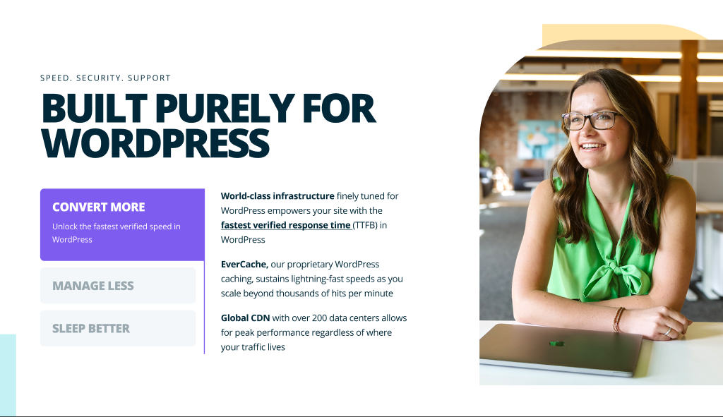
Feature Callout
Side-by-side callout — image on the right, headline + supporting copy on the left, with a stack of interactive feature buttons underneath.
The buttons swap the image and copy on click, so one section can carry three or four sub-stories without growing the page.
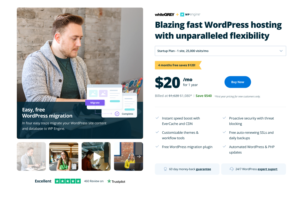
Product Page Hero
Hero section for the Migrate product page — pricing, primary CTA, trust signals, and an illustration that previews what the tool actually does.
Product hero pages either explain or sell. This one tries to do both without picking a side.
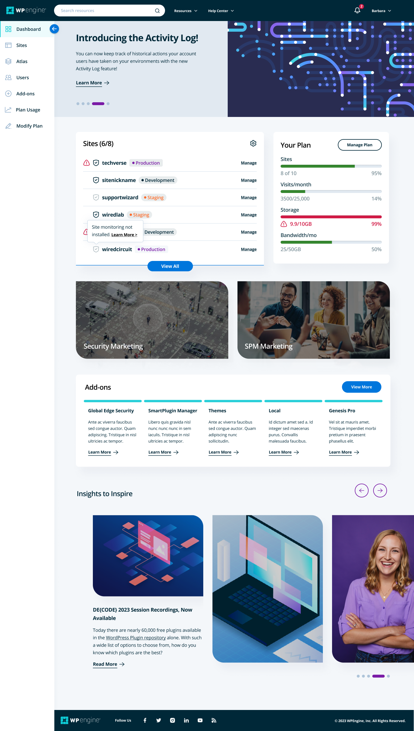
Dashboard
Customer portal home — environments list, carousel, and notifications. Designed to surface what customers do most without burying it in submenus.
Long page on purpose. Different customer segments care about different things, so the page lets each find their own first.
Case Study
Long-form individual case study — quote up top, the story in the middle, results at the bottom.
Designed to read like an article, not a brochure.
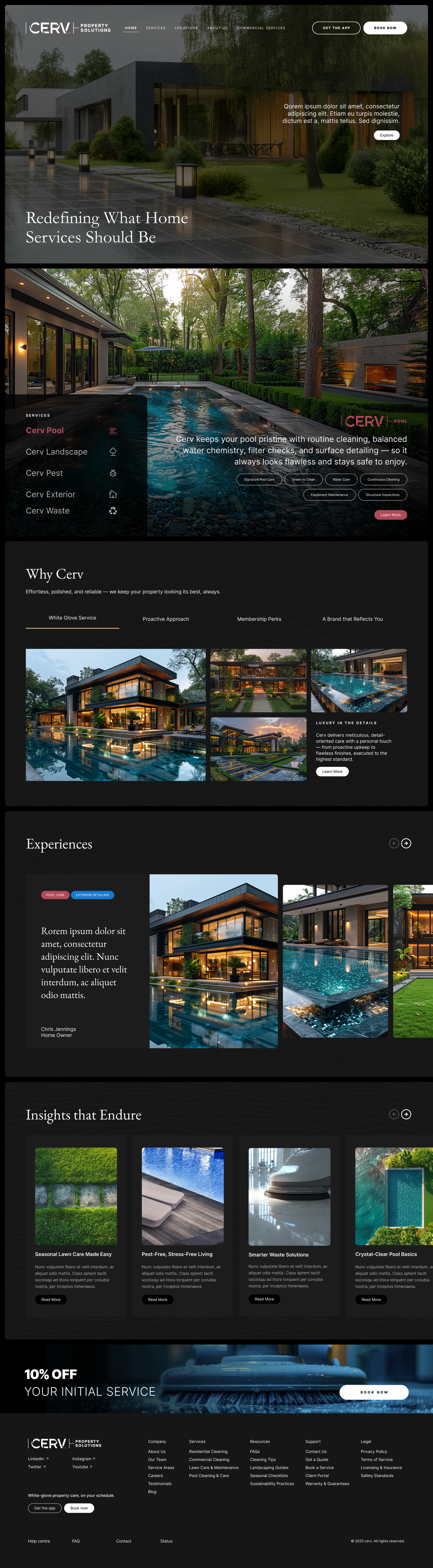
Cerv Property Solutions
Unified, technology-enabled property care company headquartered in Austin.
Cerv merges residential and commercial maintenance — landscaping, pool care, pest control, exterior cleaning, janitorial — under one white-glove service standard. Designed the marketing site that introduces who they are and what makes the unified model different.
- Role
- Product designer
- Scope
- Marketing site · 6 sections
- Client
- Cerv Property Solutions
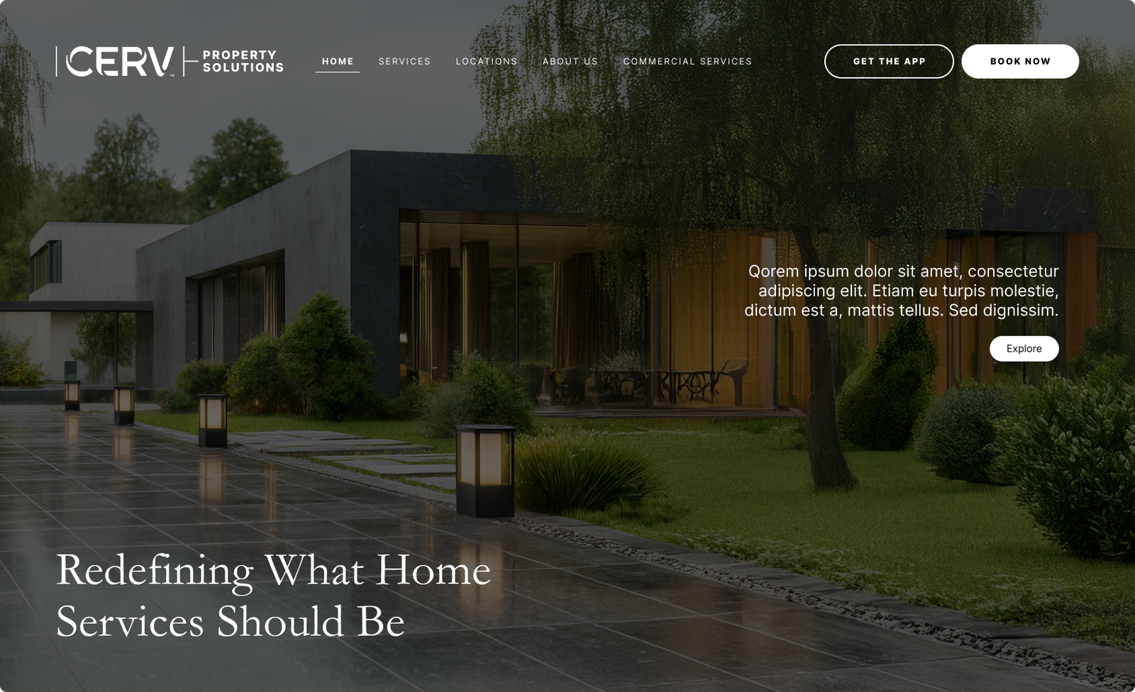
Header
Top of the marketing site — headline, supporting copy, and a primary call to action introducing what Cerv does.
The first job: convince someone who's never heard of Cerv that property care can feel premium.
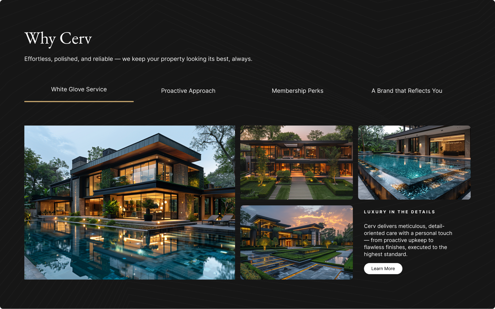
Why Cerv
The pitch — what makes the unified service model different from the patchwork of vendors most properties juggle.
Tried to lead with the customer outcome, not the operational story.
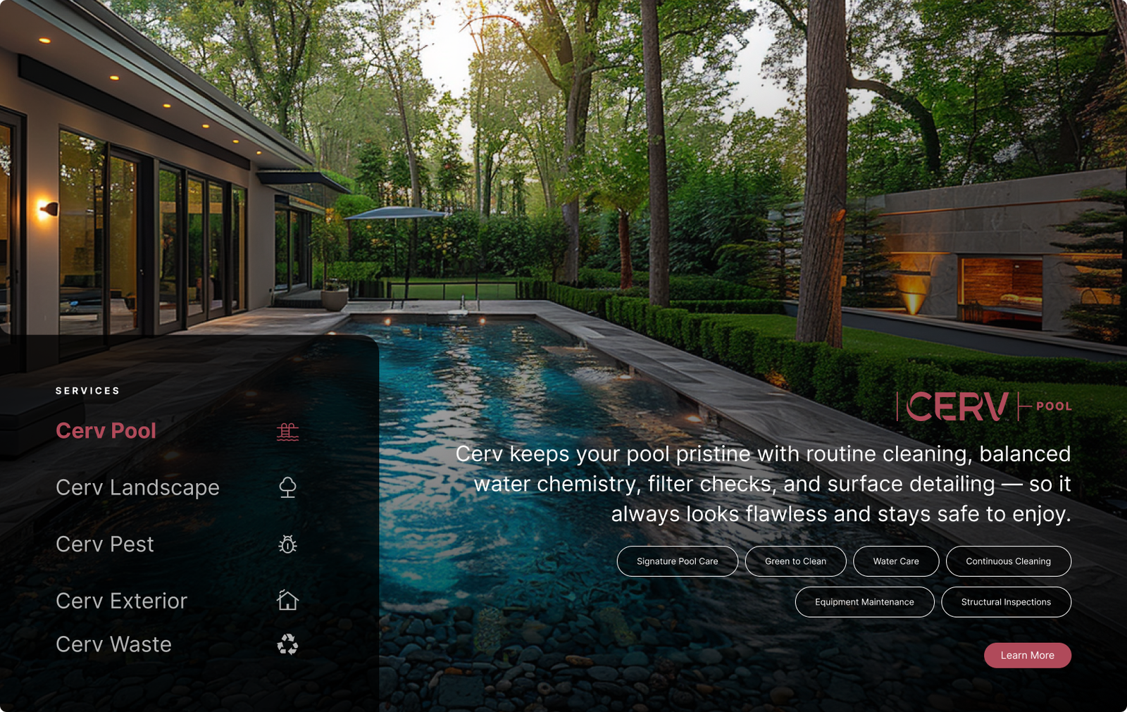
Services
Landscaping, pool care, pest control, exterior cleaning, janitorial — laid out so the breadth of the offering reads at a glance.
Lots of small icon + text blocks could've turned into a list. Treated each one like its own small story instead.
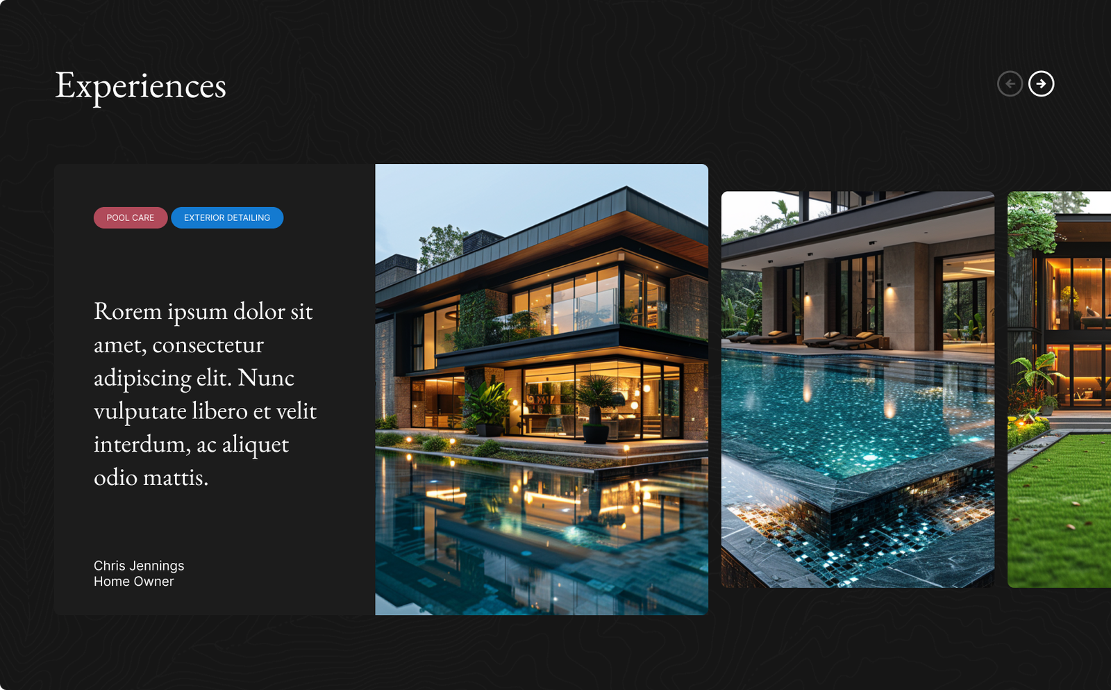
Experiences
Real properties Cerv looks after — photographs and short stories about what the team did and why it mattered.
Property care is invisible when it's done right. This section is where it gets credit.
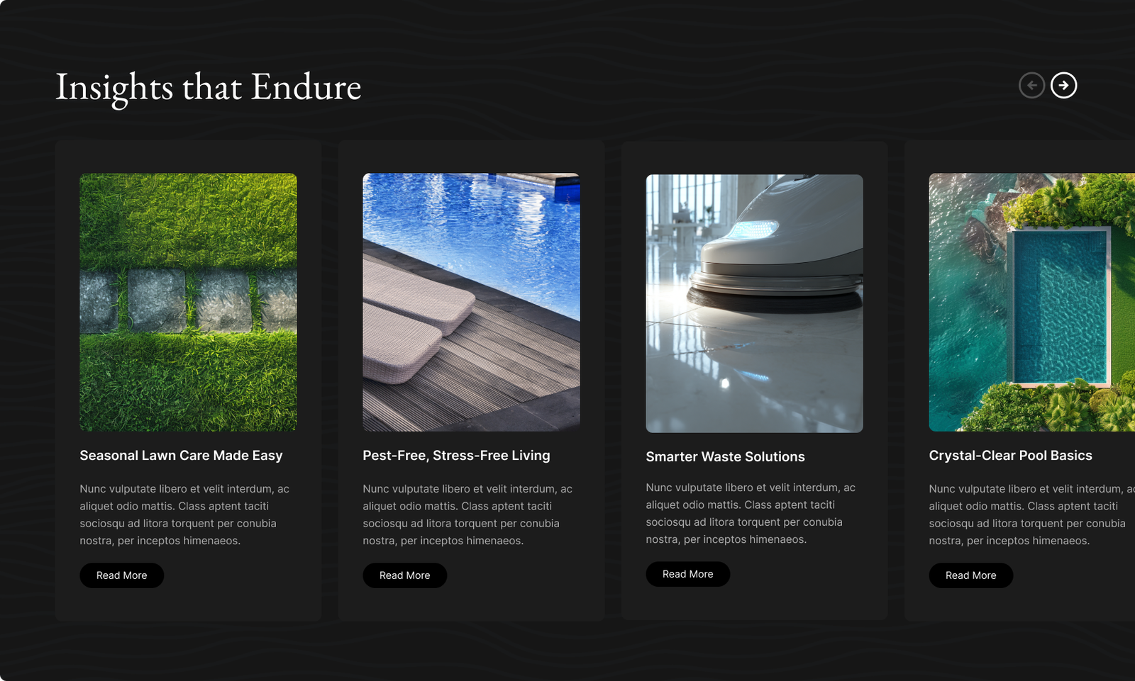
Insights
Editorial section — articles, guides, and seasonal advice from the Cerv team.
An expertise play. Property owners trust the company that already taught them something.
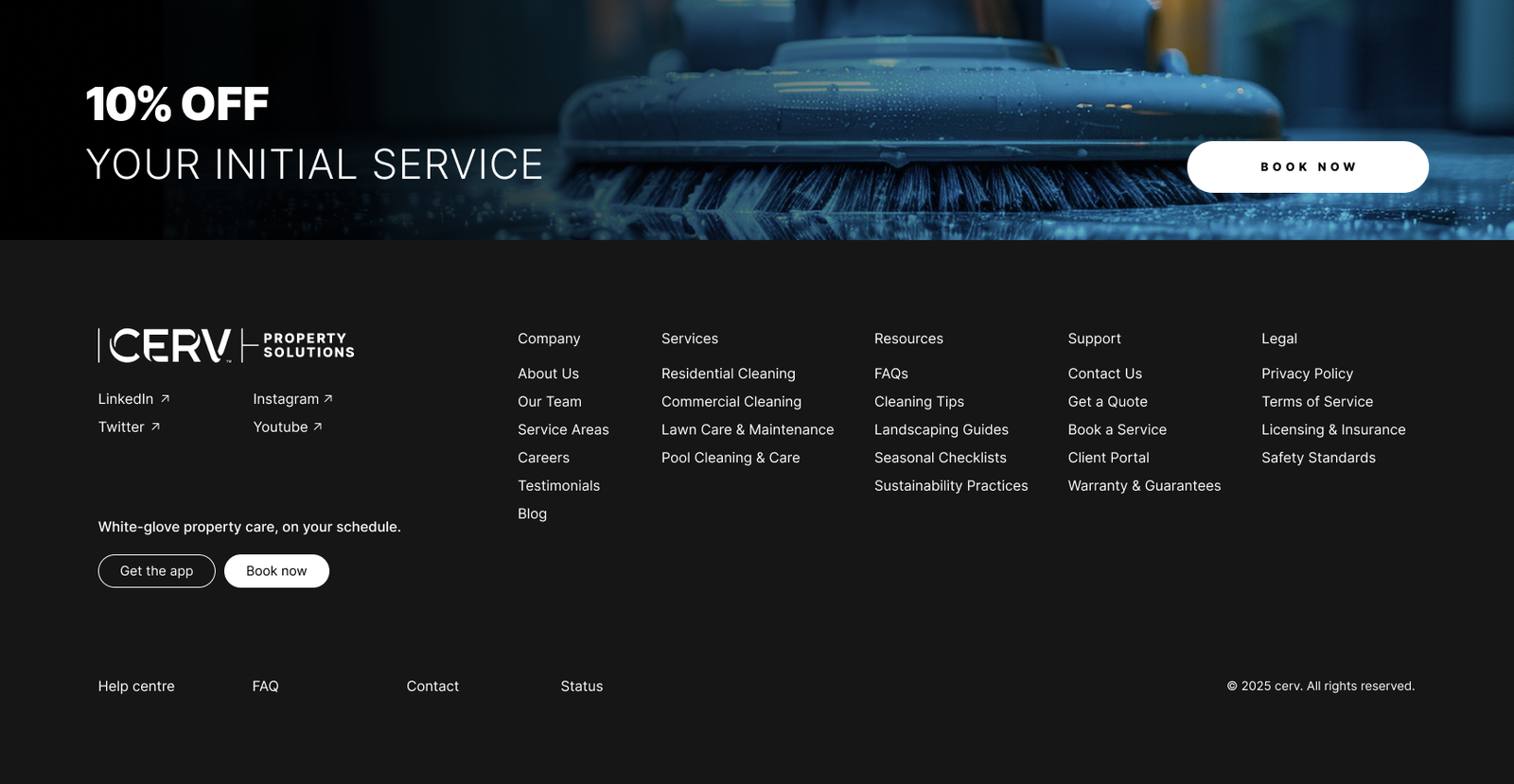
Bottom CTA
The final ask — a clear primary action and a footer that reinforces the brand without hijacking the page.
By the time someone gets here, they've decided. Just had to make sure the next step was obvious.
Full Page
The whole marketing site top to bottom — header, value prop, services, experiences, insights, and the closing CTA.
Long pages live or die on rhythm. Each section sets up the next without feeling like a list.
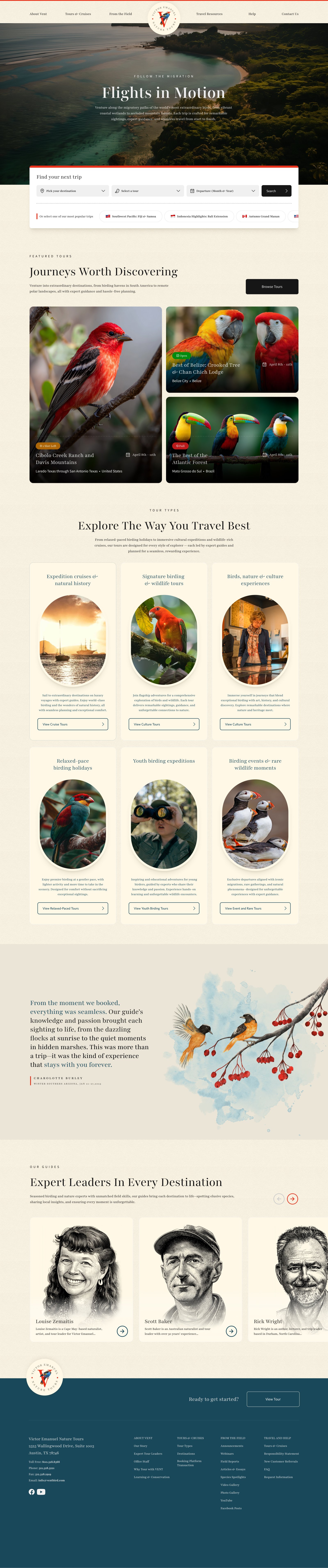
Victor Emanuel Nature Tours
Premier birding and wildlife tours, guided across Europe, South America, and the US.
VENT runs trips for everyone from serious birders to casual nature travelers — intensive expeditions, Signature Short Tours, and easy-paced trips. Designed the marketing homepage, balancing the science-rich audience with the slower-paced traveler.
- Role
- Product designer
- Scope
- Marketing homepage
- Client
- Victor Emanuel Nature Tours
Homepage
Full marketing homepage top to bottom — featured tours, destinations, trip styles (intensive, Signature Short, easy-paced), guides, and the editorial story behind VENT.
The audience splits between expert birders and curious travelers, so the page had to lead with the imagery without losing the depth serious birders come for.
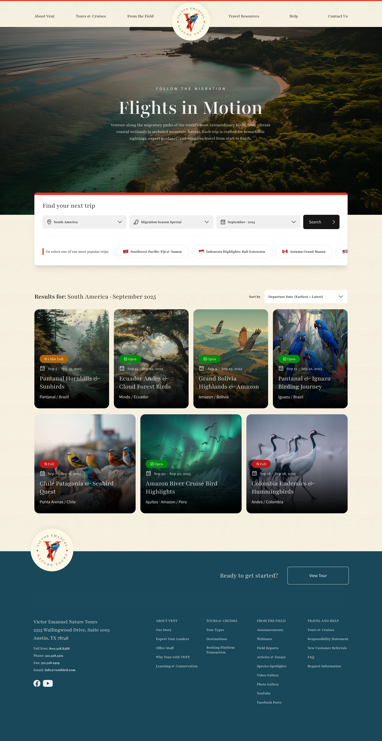
Search Results
The page travelers land on after filtering by destination, trip style, or date. Tour cards laid out in a scannable list with the essentials — duration, dates, group size, guide.
Birders search differently than casual travelers. Filters had to support both without privileging one.
Tour Detail
Individual tour page — itinerary, guide bios, species lists, day-by-day breakdown, gallery, and the booking CTA.
One of the longest pages in the system. Held together by a sticky overview that tells you where you are even after 30 seconds of scrolling.